Author: Ethan Publish Time: 2026-10-14 Origin: Milestone

A shared color reference helps translate a design direction into a coordinated product collection.
IN THIS ARTICLE
Color perception can vary between screens and physical materials. A rich olive on a monitor may appear somewhat different once it is applied to pebbled calfskin or coarse cotton canvas, because screens emit RGB light while physical substrates absorb and reflect ambient light.
In contract handbag manufacturing, vague color descriptions can create avoidable friction. Even a modest undertone difference may disappoint customers with high color expectations, increase returns, or require extra time for review and adjustment.
This operational risk is why production teams rely on the Pantone Matching System. Operating as an industry-standard color reproduction system featuring over 2,100 standardized shades, it gives design studios and factory dye houses a shared reference that makes color discussions clearer and production targets easier to repeat.
In 1963, Lawrence Herbert revolutionized commercial printing by standardizing ink formulations into what became the Pantone Matching System. Prior to this breakthrough, color communication was notoriously subjective; an art director's vision of deep crimson rarely aligned with a pressman's ink mix. The same communication gap can occur today when teams review colors on different, uncalibrated screens. A refined olive may appear greener on one display but duller and browner on another, potentially leading the team toward Pantone 448 C, famously dubbed the 'world's ugliest color'. PMS reduces this ambiguity by giving designers and manufacturers standardized codes, formulas, and a shared physical color reference—creating a universal color language for modern manufacturing.
For designers seeking to understand whether PMS is the same as Pantone, the true distinction lies in practical production control. Physical swatch books fan out across tanneries, dye houses, and cutting tables worldwide, providing a tangible standard for checking how a digital color direction translates into production. As documented by Wikipedia, the foundational idea behind the PMS is to allow designers to color match specific colors when a design enters production, regardless of the disparate equipment used to produce it.
This disciplined spot color methodology is fundamentally different from arbitrary visual matching. Gauging raw materials under shifting warehouse lights or relying only on uncalibrated digital mockups can make batch differences and finish variations harder to manage. By anchoring production to pre-mixed ink and dye formulas rather than subjective visual estimates, brands can improve consistency among drum-dyed leather, edge paint, and bespoke hardware finishes produced by different facilities.
When opening a Pantone fan deck, the alphanumeric code tells a specific chemistry story. In the traditional Pantone Matching System (PMS) engineered for commercial print, suffixes dictate substrate absorption. A code ending in C (Coated) simulates ink on slick, glossy paper where light bounces cleanly off the sealed surface. Swap that letter for a U (Uncoated), and that identical ink formulation sinks deep into porous paper fibers, appearing visibly muted, flatter, and noticeably darker under standard daylight bulbs.
Physical consumer goods often require a different reference from graphics and print. Press ink behaves nothing like hot drum-dyes binding to pebble-grain cowhide or pigment bath treatments on woven webbing. Enter the Fashion, Home + Interiors (FHI) library, an ecosystem developed specifically for tactile product development. Material science dictates the suffix; as clarified by Pantone, TCX references textiles, while TPG references pigments and coatings. TCX swatches are dyed directly onto textured cotton swatches, capturing real-world light scatter and dye saturation for soft goods, whereas TPG (Textile Paper - Green) relies on non-toxic nitrocellulose lacquer on paper to replicate hard trims, synthetic coatings, and semi-gloss leather finishes.
For industrial bag buyers and product developers, a standard PMS "C" code can be a useful starting reference, but it may leave room for interpretation when applied to dyed hides. Differences in material and lighting can create metamerism, where colors appear aligned under one light source and less consistent under another. For tactile products, teams can also consider FHI references such as TCX or TPG, then confirm the target with lab dips or approved material swatches. This combination helps manufacturers coordinate top-grain leather shells, edge paints, and dyed nylon linings across production runs.
Digital screens radiate light through additive RGB, projecting expansive gamuts that look brilliant on an illuminated display. Shift that digital artwork into physical production, however, and reality sets in. Standard commercial printing relies on subtractive CMYK, layering microscopic rosettes of cyan, magenta, yellow, and black ink. Because these tiny halftone dots merely trick the human eye from a distance, some vivid RGB tones can appear less saturated when reproduced in CMYK, particularly rich oranges, deep cobalts, and jewel-toned purples.
Pantone sidesteps dot blending entirely. Instead of forcing four process inks to simulate a shade on the fly, spot colors utilize standalone, premixed inks compounded before they ever strike a press cylinder. As Wikipedia notes regarding print physics, roughly 30% of Pantone's traditional spot color library cannot be accurately reproduced through CMYK, depending instead on 13 base pigments (14 including black) mixed in exacting proportions. When transitioning prepress assets into real-world materials, utilizing an intuitive CMYK to Pantone converter provides a practical starting point for comparing four-color approximations with nearby Pantone references before proofing.
The trade-off hinges on scale and visual integrity. Process printing can be cost-efficient for multi-hued graphics, although registration and color can vary between production conditions. Premixed Pantone inks can reduce this variation and provide more uniform coverage, making them a useful option when coordinating custom hardware coatings, edge-paint formulas, and branded packaging across suppliers.
Translating a flat swatch onto genuine hide introduces natural variables that differ from paper or synthetic film. Porosity varies across a hide, with looser belly fibers often absorbing dye differently from denser areas. Vegetable tanning also contributes a warm base tone that can influence how clean pastels or cool greys appear after coloring.
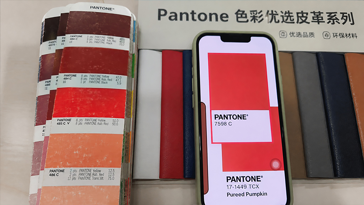
Evaluating pigment saturation and grain penetration across natural leather swatches against standardized color chips.
To bridge this gap, tanneries toggle between two finishing philosophies: penetrative drum dyeing and topical pigment coatings. Drum dyeing tumbles aniline dyes deep through the cross-section of the hide, preserving the grain's buttery hand-feel and distinct pore structure; however, because the natural ground tone shows through, matching a Pantone target may require a practical tolerance range. Conversely, topical pigment finishes add a more opaque surface layer, which can make close color matching easier by reducing the visual effect of natural variation. As Pantone explains, color appearance can change across substrates, and some vibrant hues may require additional surface finishing to approach the intended reference.
Even when the wet formula aligns with your target, post-tannery processing triggers secondary shifts. Protective clear coats alter light refraction—a high-gloss topcoat deepens chroma, whereas a dead-matte seal can make deep navies look chalky. Texture compounds the variance: deep pebble grains cast micro-shadows that visually darken the surface compared to smooth box calf leather. Finally, genuine leather continues to evolve long after cutting. Daily exposure to sunlight, friction, and skin oils oxidizes the fats within the hide, gradually developing a darker patina that may move the appearance away from the original color reference.
Visual assessment alone has limits when dyed hides move from tannery drums to the cutting table. In factory quality control, technicians rely on benchtop spectrophotometers to quantify color difference using the Delta E (ΔE) metric. By calculating the mathematical distance between an approved master swatch and production leather across CIELAB coordinates, this instrument supplements comments such as "slightly too pale" with measurable, traceable data.
Acceptance thresholds vary with the material, finish, measurement method, product positioning, and agreed quality standard. Commercial programs may allow modest natural variation to balance appearance and cutting yield, while premium projects often set narrower tolerances for visible exterior panels.
Illustrative Delta E (ΔE) Reference Ranges for Color Discussions
| ΔE Value | Visual Perception | Manufacturing Benchmark |
|---|---|---|
| ΔE < 1.0 | Often difficult to notice under controlled conditions | A possible target for closely controlled approvals |
| ΔE 1.0 – 2.0 | A small difference may be visible on close review | A practical discussion range for some materials and finishes |
These ranges are illustrative rather than universal acceptance standards. Actual limits should be agreed for the material, finish, illuminant, viewing geometry, and measurement method. Numerical compliance alone does not guarantee visual harmony; surface grain, topcoat gloss, and protective waxes inevitably influence how light reflects off finished leather. To reduce metamerism risk—where swatches appear aligned under one light source and different under another—production teams should review physical lab dips under agreed lighting, often including a calibrated D65 light booth. Comparing swatches with approved masters against a neutral background helps teams make a more consistent decision before cutting exterior panels.
When sourcing overseas, a subtle shift from warm terracotta to dull brick can affect how consistently a collection appears across markets. Systematic Pantone specifications reduce ambiguity by establishing a shared color baseline across the supply chain.
At Milestone, we translate digital codes into physical production through our specialized leather bag manufacturing facilities. Our technicians run rigorous lab dip sampling across full-grain hides, calibrating drum dye absorption and verifying surface reflectance using high-precision spectrophotometers to support closer batch-to-batch consistency. Digital conversion tools help establish the initial direction, while lab dips, physical swatches, and measured checks refine the final production target.
Build a clearer, more repeatable color approval process for your next collection. Schedule a custom product development consultation with our leather engineering team today to review your technical swatches and sample your next collection.
Ready to start your custom project?
Expert insights on care, styling, and manufacturing.
Texture, absorption, and light reflectance can influence the result. Paper usually presents ink on a relatively flat surface, while cotton absorbs dye into textured fibers that scatter light differently. The reference code still provides a useful common direction, and reviewing a sample on the intended material helps confirm the final appearance.
Replace a guide when fading, staining, heavy handling, or age makes comparison less reliable. Storage conditions and frequency of use affect its useful life, so teams should also follow the care and replacement guidance for the specific Pantone product they use.
A HEX value can be used to identify nearby Pantone references for early design and supplier discussions. Our RGB and HEX to Pantone Converter makes that first comparison easier. Because screens and physical materials reproduce color differently, confirm the selected direction with an appropriate physical guide, material sample, or production proof before final approval.
Share the color reference, intended material, finish, lighting expectations, and acceptable variation. A physical reference or approved sample is especially helpful when available. These details give the manufacturer a clearer target for preparing lab dips or strike-offs and make feedback easier to document.