Author: Ethan Publish Time: 2026-03-18 Origin: Milestone

Pantone's announcement of Cloud Dancer as the Color of the Year 2026 signals a shift toward materials that feel clean, honest, and quietly expressive. The shade may read as a soft white at first glance, but designers across leather goods, coated textiles, metal hardware, and recycled composites are already treating it as a versatile foundation tone that can carry both minimal and luxury-forward aesthetics. In production conversations with any leather bag manufacturer or materials supplier, Cloud Dancer is likely to surface as a reference point for seasonal palettes and finish directions. Expect it to influence consumer expectations as well, especially in categories where texture, subtle contrast, and surface clarity guide purchasing decisions.
Pantone's choice of Cloud Dancer reflects a growing desire for steadiness in a year defined by cultural noise and economic recalibration. The tone sits at the intersection of softness and structure, and Pantone has signaled that this restrained white carries a message of recovery, clean starts, and sensory calm. That clarity matters in 2026, when consumers are navigating fast‑shifting identities, geopolitical tension, and a digital ecosystem that rarely pauses. In this moment, a color that feels almost weightless can read as a quiet form of resilience.
Cultural drivers point to an appetite for materials and palettes that soothe without slipping into sterility. Wellness has moved beyond mood lighting and self‑care jargon; it now shapes how people read surfaces, textures, and colors in the objects they carry or place in their homes. A neutral like Cloud Dancer supports this shift because it pairs easily with both earthy pigments and high‑contrast industrial tones, giving manufacturers and designers a flexible canvas for experimentation.
Industry analysts have also noted that neutrals with a wellness bent are gaining traction across sectors. That momentum is reinforced by the observation that the December announcement of Pantone's 2026 Color of the Year will influence palettes across fashion, interiors, automotive, and global marketing. For brands planning seasonal lines or long‑lead product cycles, Cloud Dancer acts as a stabilizing reference point. Its adaptability helps luxury makers—especially those working with textured materials, from brushed leather to structured synthetics—shape collections that feel modern without chasing volatility.
Cloud Dancer carries a soft, chalk‑white base warmed by faint peach and mineral undertones, giving it a temperate quality that sits between cool and neutral. This balance is why the shade reads clean rather than stark; there's a quiet warmth beneath the surface that prevents the color from drifting into icy territory. Because the Color of the Year emerges from a continuous, worldwide dialogue among color experts—a process noted by researchers familiar with Pantone's methodology—its undertone profile is engineered for broad adaptability across materials and lighting conditions.

On full‑grain leather, Cloud Dancer tends to accentuate natural grain patterns, creating a subtle contrast that luxury buyers often associate with higher craftsmanship. The tone looks denser on lightly corrected hides, where pigments sit closer to the surface. Textiles behave differently; woven nylon and canvas scatter light, so the color can shift toward a slightly cooler register, especially in outdoor gear or structured handbags. Molded materials, including EVA and bio‑resins, produce the most uniform interpretation, but manufacturers should expect a touch more reflectivity, which can make the shade appear brighter than it does on organic substrates.
Lighting plays a decisive role. Under natural daylight, Cloud Dancer reveals its soft warmth, almost like a matte eggshell. LED retail lighting leans blue, nudging the color cooler and giving crisp edges to silhouettes. Warmer incandescent or hospitality lighting pushes its peach undertone forward, creating a creamier appearance that can alter how trims and hardware read against it. For brands coordinating multi‑material collections, anticipating these shifts is essential for color consistency across leather goods, apparel, and molded accessories.
Brands exploring Cloud Dancer for upcoming luxury lines often begin with small, high-impact categories—structured handbags, compact goods, and travel accessories—where a crisp neutral can shift the entire silhouette. The shade works especially well in resort capsules or early-spring drops, giving buyers a clean anchor color that pairs with metallic trims, textured grains, or recycled synthetics without overpowering the materials. When design teams want a reference point for early palette planning, they often turn to tools like our Pantone color chart reference edition, available through this internal guide: our Pantone color chart reference edition.

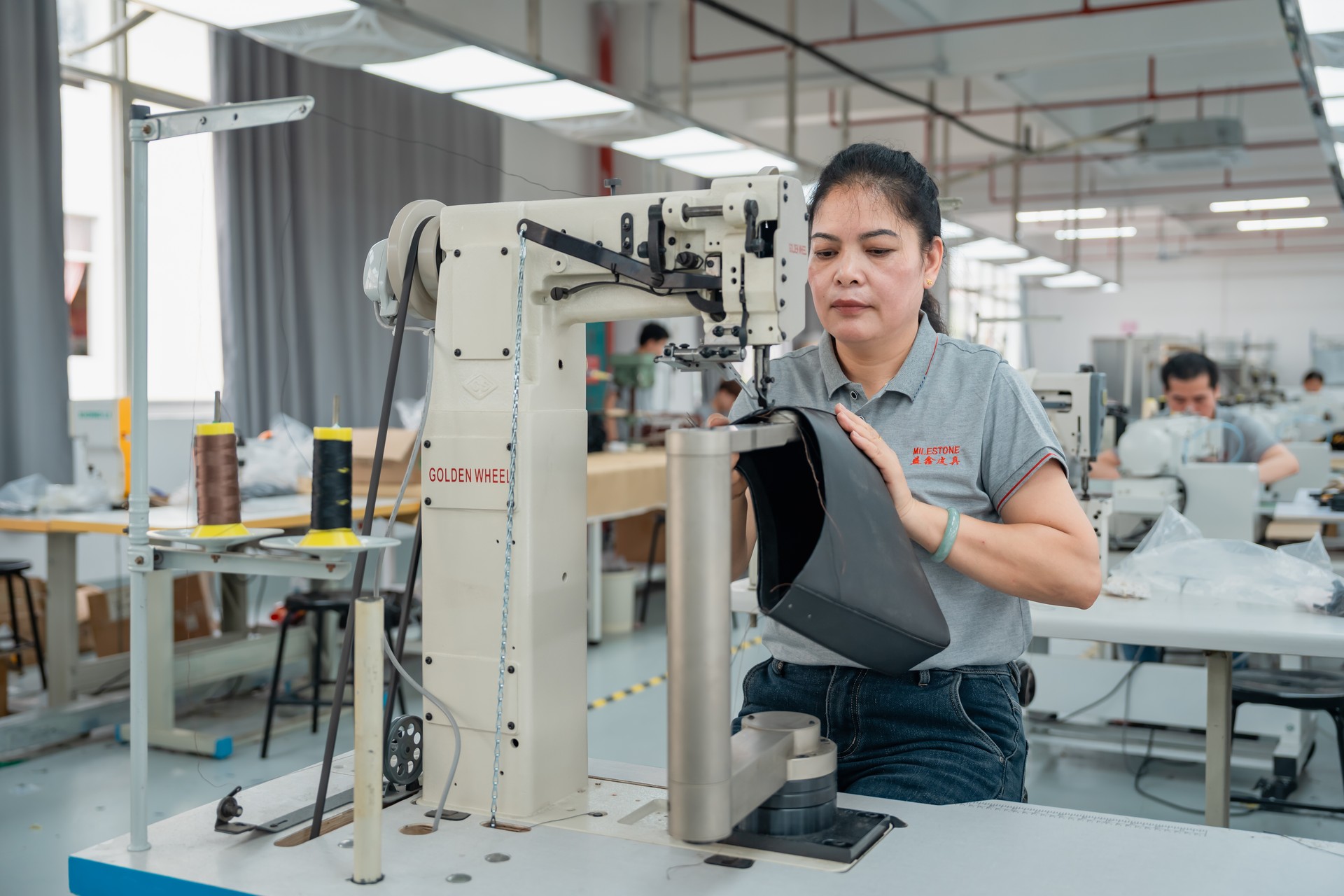
Prototyping usually benefits from a staged approach. Teams might begin with swatch cards or coated split-leather strips to see how Cloud Dancer behaves under different embossing depths, then move to small-batch cut-and-sew samples that test edge paint adhesion and UV stability. This hands-on progression helps designers judge how the color sits against hardware finishes or woven straps, especially in categories that face daily abrasion.
For B2B workflows, the most reliable results come from a shared color pipeline. A unified spec sheet, consistent lightbox testing, and digital profiles calibrated across suppliers ensure that the white hue stays true as it moves from design files to tannery treatments to final assembly. Many manufacturers now build approval loops that include photographed swatches and physical chips shipped in tandem, reducing color drift before production begins. This kind of structured coordination keeps Cloud Dancer crisp, consistent, and production-ready across global manufacturing hubs.
Designers building 2026 collections are already treating Cloud Dancer as a clean, breathable base that needs thoughtful companions. Soft mineral tones—mist grey, wheat beige, and sand-brown—steady its minimalism, while a single saturated accent such as saffron, deep currant, or petrol blue can push products into a more luxury-forward palette without swallowing the quiet clarity of the base shade. To explore these harmonies, many teams rely on our Pantone color finder to identify the perfect aesthetic balance. Tools like our Hex to Pantone converter allow for a precise color matching guide, helping designers quickly discover alternative tones and nuanced coordinates that bring a creative vision to life.
Cross-material harmony matters just as much. A Cloud Dancer nylon weave paired with a grainy leather panel in warm clay gives depth, while coated canvas in the same palette creates a bridge between accessories, travel goods, and seasonal small leather goods. When every material carries a slightly different texture, the color work must do the stitching, and a balanced palette ensures the line feels intentional rather than improvised.
Complementary Palette Framework for 2026 Collections
| Palette Element | Function | Notes |
|---|---|---|
| Mineral Neutrals | Balance Cloud Dancer | Works across leather, canvas, and technical fabrics |
| Bold Accents | Add luxury focus | Use sparingly for trims or limited-edition variants |
| Cross-Material Matches | Maintain cohesion | Align Pantone codes across suppliers for consistency |
Consumers continue to gravitate toward clean, calming tones, and Cloud Dancer sits squarely in that comfort zone. Shoppers describe these soft neutrals as a way to quiet visual noise, especially in wardrobes crowded with saturated colors and heavy patterns. This pull toward simplicity echoes broader wellness habits—slow mornings, uncluttered rooms, products that feel honest in the hand rather than overly ornamented. Many of the same buyers who favor mindful routines now look for accessories that project quiet confidence, a shift that has revived interest in neutrals across categories, including handbags, footwear, and small leather goods.
Demand for Cloud Dancer–inspired products is expected to rise through 2026, particularly in items where texture and craftsmanship can shine. Buyers want pieces that feel restorative, and this shade gives manufacturers a dependable foundation for collections built around calm, wellness, and understated sophistication.
Milestone supports brands exploring Cloud Dancer by drawing on deep experience in custom leather coloration, where subtle shifts in undertone or finish are tested until the shade holds steady under studio lights and daily wear. Our sampling and prototyping teams move quickly, producing small-batch panels, hardware-matched swatches, and pre-production mockups that help designers judge how this soft white interacts with grain, coatings, or structured silhouettes. These hands-on trials often reveal details—like how a matte surface absorbs light differently than a semi-gloss finish—that shape confident collection planning.

Brands ready to work Cloud Dancer into upcoming assortments can reach out through our main site and start a collaboration that brings color standards and material performance into alignment. Designers are invited to share early concepts, and we'll refine the materials together.
Cloud Dancer closes 2026 with a quiet confidence, reminding designers how a restrained shade can shift the entire mood of a collection. Its soft, chalk‑white character creates room for inventive material work, whether through matte coated fabrics, lightly textured leather, or recycled blends that carry subtle warmth. As brands search for colors that feel both clean and grounded, this hue offers a practical path into new silhouettes and refreshed luxury basics. Now is the moment to prototype, test finishes, and shape collections that let Cloud Dancer breathe, so your next launch arrives with a calm, modern edge.
Ready to start your custom project?
Expert insights on care, styling, and manufacturing.
A Pantone Color Chart is a standardized system for identifying and matching colors, serving as a universal language for designers, manufacturers, and brands across various industries, including fashion. Each color is assigned a unique numerical code, ensuring consistency and accuracy from conception to production. This system facilitates precise color communication and reproduction worldwide.
The Pantone Color of the Year is a specific shade announced annually by the Pantone Color Institute, serving as a global trend forecast impacting fashion, interior design, and product development. It reflects cultural mood and societal shifts, influencing designers worldwide. This selection aims to highlight color's powerful role in expressing current global sentiment.
The Pantone Color of the Year program began in 2000. This initiative was launched to reflect the global cultural zeitgeist, with Cerulean Blue being the inaugural selection. It aims to influence product development and purchasing decisions across various industries, providing a symbolic snapshot of the year's mood, trends, and collective spirit.
The Pantone Color of the Year significantly influences fashion trends and consumer choices. It acts as a global trend forecast, guiding designers in developing collections, from apparel to accessories. This annual selection helps shape the aesthetic direction for the upcoming year, impacting everything from runway looks to retail offerings and product development across the industry.
No, using Pantone colors for commercial applications generally requires licensing or purchasing their official products. However, you can use alternative color references derived from Pantone standards, such as the Precise Color Matching Guide from Milestone. These resources provide a cost-effective way to find matching shades and coordinates for your creative projects without the need for proprietary software.
Although HEX codes are digital values and Pantone is a physical ink system, a professional Hex to Pantone color converter can instantly identify the closest visual match across proprietary libraries. Our digital Pantone color finder bridges this gap by instantly calculating the closest visual equivalent from thousands of swatches.
Pantone 7686 C is a rich, medium-to-dark blue. It presents as a sophisticated and vibrant shade, often likened to a deep royal blue or a classic sapphire. This versatile color offers a sense of stability and elegance, making it a popular choice for designs seeking a bold yet refined statement in fashion and various creative applications.
The Pantone Color Chart ensures consistency by providing a globally standardized system of precise color formulas and numerical identifiers. It serves as a universal language, allowing designers, manufacturers, and brands to communicate exact color specifications. This standardization minimizes subjective interpretation, guaranteeing accurate color reproduction across various materials, locations, and production runs worldwide.