Author: Ethan Publish Time: 2026-03-19 Origin: Milestone

Pantone's annual announcement has become a quiet force in the design world, shaping the colors that appear on runways, packaging shelves, and digital mood boards. The Pantone Color of the Year isn't just a trendy shade; it's a signal that reflects cultural mood and guides how creative teams approach upcoming collections. As designers study this forecast, they often treat it as a compass—one that helps them decide which tones might feel fresh on a textured canvas, a plated buckle, or a panel of full‑grain leather. For manufacturers and brands working with materials and leather goods, understanding this choice early can influence material sourcing, seasonal palettes, and the subtle details that determine whether a product feels current or a step behind.
Every year, the Pantone Color Institute selects a single shade that captures the cultural mood and signals where design trends are headed. Many people searching for what is Pantone color are really trying to understand why one hue manages to ripple across industries—from handbags and apparel to home goods and digital branding. The Pantone Color of the Year program exists for this exact purpose: to create a shared reference point that designers, product teams, and marketers can respond to as they plan seasonal collections.

The selection isn't random. Pantone's forecasting team studies global movements—shifts in consumer behavior, technology, art, and even political undercurrents—to identify a color that feels timely. This annual prediction gives creative teams a direction worth watching, especially when they're building out palettes months before products ever hit the market. Teams that want a deeper look at the system behind the palette often explore guides like the one linked here: what every designer should know about Pantone.
Because of this process, the Color of the Year doesn't stay confined to design studios. It shows up in storefronts, on packaging, in beauty launches, and in textiles the moment manufacturers begin weaving it into their production cycles. The shade becomes a kind of shorthand—one that helps brands feel current and gives consumers a visual cue of what's trending. For a manufacturer deciding how to shape next season's materials, this influence is practical, not symbolic, and it often guides which tones are sourced, sampled, or pushed into full-scale development.
The idea behind the Pantone Color of the Year began in 1999, a moment when designers across fashion, home goods, and branding were all searching for a shared visual language to guide seasonal planning. Pantone's forecasting team wanted more than a trend report; they aimed to build a cultural marker that captured how people were feeling as the world shifted toward a new millennium. Their first choice, Cerulean Blue, reflected that mood with a calm, almost airy quality that eased the anxieties of Y2K chatter and rapid technological change.
What started as a single announcement slowly turned into an annual ritual. By the mid‑2000s, design studios, manufacturers, and retailers were watching the reveal as closely as they watched economic forecasts, because the chosen shade often shaped product palettes for months. The program expanded as Pantone's research methods grew more sophisticated, blending global travel, material studies, and cultural analysis. Today, the selection lands with real weight: once the color is named, you can see it ripple through handbag lines, packaging experiments, and even upholstery swatches. It's become a touchpoint that links creative intuition with market demand, year after year.
The Pantone Matching System sits at the center of how the Color of the Year is chosen because its structure forces discipline. Each hue is assigned a precise PMS number, grouped into swatch families that move gradually from warm to cool tones. Designers often keep physical decks nearby, since running a fingertip across the coated and uncoated paper chips offers a quick reminder of how the same number can shift slightly depending on finish. For teams that rely on exact replication season after season, references like our own Pantone color chart resource help anchor conversations around a shared visual language.

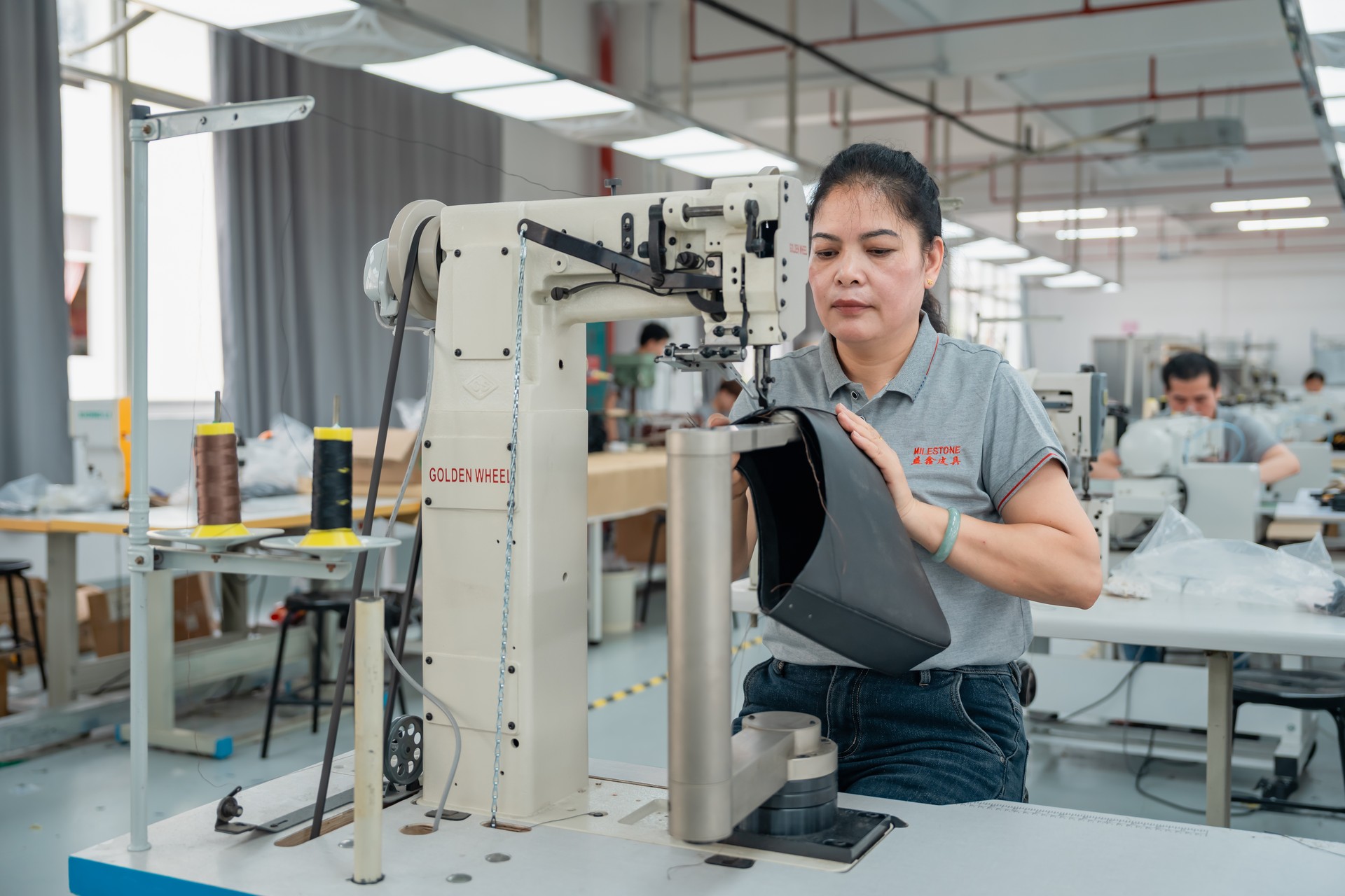
This system matters even more once a color leaves the paper stage. Leather, canvas, coated fabrics, and metal hardware each absorb pigment differently, and a shade that looks peach on a matte calfskin might lean dusty on a synthetic blend. Maintaining color consistency across materials demands tight tolerances during dyeing and finishing, supported by labs that compare every test piece to the official PMS target under controlled light.
Luxury product development depends on this accuracy. A misaligned tone can make a handbag panel look mismatched or cause a seasonal design to fall short of its intended mood. When teams understand what the Pantone color signifies in its purest form—and how faithfully they can match it across complex materials—they gain the confidence to plan collections without risking costly rework or uneven production runs.
Core Components of the Pantone Matching System
| Component | Purpose |
|---|---|
| PMS numbering | Creates a universal reference for identifying specific hues |
| Swatch families | Organize colors by tone for easier selection and comparison |
| Material cross-checking | Ensures consistent appearance across leather, textiles, and hardware |
| Controlled color testing | Verifies accuracy under standardized lighting conditions |
The Pantone Color of the Year 2026 is expected to signal a soft reset, leaning toward a shade that feels clean, breathable, and quiet on the surface while carrying a steady undercurrent of optimism. Many designers describe it as a tone with a chalky softness—something that catches light without feeling slick—inviting a sense of calm after several years of visual intensity across fashion and interiors. Its emotional direction leans toward restoration. People want colors that steady the pulse rather than spike it.
This shift grows out of larger cultural forces. Global audiences are navigating digital overload, geopolitical tension, and a craving for materials that feel less processed. In that environment, a hue with subtle warmth and a gentle, powdery cast makes sense. It pairs well with the push toward sustainability because it reminds buyers of natural surfaces—sun‑bleached canvas, washed minerals, or uncoated paper. Creative teams exploring the early forecasts for 2026 have already begun examining how tones similar to Cloud Dancer might behave across textures, which ties naturally to discussions like the ones in the guide on how this shade may influence future accessory palettes: how this direction may shape next year's handbag tones.
For luxury manufacturers and B2B material buyers, the 2026 direction opens practical opportunities. A restrained color works beautifully on full‑grain leather, where the fine creases and character of the hide become visible instead of being buried under pigment. It also adapts well to recycled synthetics, especially when a brand wants to showcase slight variations or a handcrafted surface. The most forward‑looking suppliers will treat this color not as a neutral, but as a canvas that highlights construction quality, giving designers room to experiment with stitching, hardware finishes, and contrasting edge paints without overwhelming the core shade.
Brands that track the Pantone Color of the Year usually begin shaping their product roadmaps months before the announcement, studying forecasting patterns and adjusting internal calendars so designers can sketch early concepts while sourcing teams negotiate viable lead times. That early alignment matters. A shade that looks energizing on a screen can behave unpredictably once it hits real materials, and leather—especially full‑grain varieties with natural oils—tends to absorb pigments in ways that shift undertones or mute saturation.
Teams often run several rounds of material testing to keep those shifts under control. Swatches might move from a lab to the cutting floor and then back again as technicians compare the finished hide to the original target using tools like the Pantone Matching System. Even then, subtle issues appear: a pebble‑grain panel may reflect light differently than a smooth strap, or a matte finish may pull the color cooler than expected. When brands rely on precise conversions, a resource such as a trusted color‑translation tool can help close the gap between digital intention and physical outcome, and solutions like our own conversion option offered through accurate Pantone color matching often streamline that process.
In leather goods manufacturing, strategic use of the annual shade goes beyond simply producing a bag in the exact hue. Many brands integrate the color in selective panels, edge paint, or interior linings to create seasonal relevance without overcommitting inventory, while some craft small accessory capsules—wallets, charms, or cardholders—that bring pantone‑inspired leather goods to market quickly and test demand before scaling.
The Pantone Color of the Year carries weight in luxury leather goods because color isn't just a surface choice; it becomes part of the material's story. When a shade gains global attention, it helps designers frame how that color behaves on full‑grain hides, how it interacts with natural oils, and how it shifts as the leather breaks in. This shared language gives brands a quick way to explain why a particular hue belongs in a seasonal assortment.

For B2B teams, the announcement lands like an early signal flare. It supports forecasting, trims guesswork, and helps product teams avoid chasing trends too late in the cycle. A timely move toward pantone-inspired leather goods can also carve out differentiation in a crowded market, especially when competitors are still debating their palette.
Milestone's advantage sits in precise color execution, from calibrated dye baths to consistent lot‑to‑lot matching that avoids the muddy undertones that often show up in poorly processed hides. Partners who come to our studio and production expertise get color accuracy they can rely on, which turns a trend into a commercially sound product line rather than a gamble.
Pantone's annual choice continues to matter because it gives designers and manufacturers a shared language, one that helps teams plan collections long before a single hide is cut. The pantone color of the year often signals shifts in consumer mood, and when brands track those signals early, they reduce costly missteps. At Milestone, we work with partners who need precise, repeatable color-matched leather that holds its tone under real production pressures. If your team is mapping next season's palette, consider how closer alignment with forecasting can keep your line coherent, on‑trend, and ready for buyers who expect consistency from concept through final shipment.
Ready to start your custom project?
Expert insights on care, styling, and manufacturing.
Pantone has occasionally selected two Colors of the Year when the theme calls for duality or contrast, such as in 2016 and 2021. These paired choices highlight broader cultural moods, allowing Pantone to express balance, resilience, or evolving trends through complementary shades rather than a single defining color.
Pantone typically announces the Color of the Year in early December each year. This timing helps designers and industries prepare for the upcoming year's trends.
Pantone does not change the Color of the Year mid‑year, even if emerging trends shift. The selection is a symbolic annual statement, chosen through extensive research and meant to represent the year as a whole. Trend updates may influence seasonal palettes, but the official yearly color remains fixed.
Pantone relies on a mix of global trend research and expert analysis, drawing from fashion, art, technology, socio‑cultural shifts, and worldwide market insights. Their trend forecasters study emerging influences throughout the year, then refine the selection through collaborative creative review rather than relying on simple data models or opinion alone.
It can be subtly influenced, as Pantone often considers cultural shifts, global moods, and collective emotions when choosing the Color of the Year. While not tied to specific political events, themes like sustainability, social change, or global uncertainty can shape the palette that best reflects the spirit of the moment.