Author: Ethan Publish Time: 2026-03-18 Origin: Milestone

Pantone exists because designers needed a universal language for color—something more reliable than a screen's glow or a swatch fading under warehouse lights. Anyone asking what is Pantone color quickly discovers it's a system built to remove guesswork, yet the challenge grows once color must behave consistently on living materials like leather. A shade that looks crisp on coated canvas can shift once it meets natural grain, oils, or the dense, fibrous underside of a hide. That's where precision becomes more than a preference. It becomes protection for your brand.
Milestone works inside that tension every day, translating Pantone standards into leather that holds its hue across batches, textures, and production runs, and serving as a steady partner when your products demand true color fidelity.
Pantone serves as a global reference point for speaking the same color language, whether a designer is sketching in New York or a production manager is reviewing leather swatches in Vietnam. The company formalized this shared vocabulary decades ago; according to a historical note on standardized colour communication, it established a system that allowed designers and printers to describe color with accuracy long before digital workflows became common. That foundation still shapes how modern manufacturers work today.
At the center of this system is the Pantone Matching System, a library of precisely formulated hues identified by unique codes. Each code acts as a contract: if a designer specifies PANTONE 7499 C, suppliers know exactly which tone to aim for—whether they're dyeing full-grain leather, coating metal hardware, or matching stitching threads. For many teams, this clarity removes rounds of guesswork and prevents costly re-runs caused by mismatched batches.
Designers lean on Pantone because leather, canvas, microfiber, and coated fabrics all absorb dyes differently, and a color that looks rich on pebble leather might dull on smooth calf. Pantone's standardized references give them a stable starting point to test across materials, ensuring the final collection holds together visually.
In fast-moving product cycles, consistency becomes a competitive advantage, and Pantone remains the most trusted tool for making sure every component—from straps to liners—lands in the same visual family.
The Pantone Matching System works by assigning each spot color a code made of two parts: a number that represents the hue and a suffix that indicates the surface it was designed for. This structure keeps color selection precise. A manufacturer reading "186 C," for instance, immediately knows the client wants a saturated red optimized for coated materials, not an uncoated paper stock or textile surface. This level of clarity is why professionals rely on PMS tools; a well‑known color authority notes that the system was originally built to help designers and printers keep logos, packaging, and other branded elements consistent across production runs.

Pantone color charts turn those abstract codes into something you can touch and compare. A designer flips through the deck to find the exact shade of tan they imagine, while a leather workshop holds the swatch against grain samples to check how the pigment might settle into the material's natural texture. The physical chart becomes the bridge between creative intention and manufacturing reality, preventing guesswork before dyes or finishes are ordered.
Pantone also maintains different libraries to reflect how color behaves on various surfaces.
Coated guides show how ink sits on glossy finishes with sharper contrast.
Uncoated guides reveal how the same pigments appear softer and slightly muted on porous substrates.
Material‑specific libraries, including those used for plastics and textiles, help teams anticipate shifts in saturation or warmth that occur when pigments bond with thicker fibers or molded components.
When brands understand these differences, the Pantone matching system becomes a reliable compass for achieving repeatable, cross‑material color accuracy.
Leather rarely accepts color the way coated fabrics or synthetics do. Each hide absorbs pigment at its own pace, shaped by its density, natural oils, and grain pattern. A tight grain may take a Pantone‑matched dye evenly, while a looser, more open grain can drink in pigment faster, creating darker patches or softer edges. This is why two hides with the same what is Pantone color target can still reveal subtle variations once finished. Natural material carries its own fingerprint.
These organic inconsistencies make direct Pantone translation challenging. Industry experts note that using a graphics-focused PMS guide for textiles or soft materials often leads to production issues; one well‑known explanation warns that relying on a graphics book to design clothing or homeware invites mismatches because the color system simply wasn't built for fibers or hides. Leather behaves even further from the controlled world of ink on coated paper, so expecting perfect one-to-one reproduction will usually set the wrong expectation.
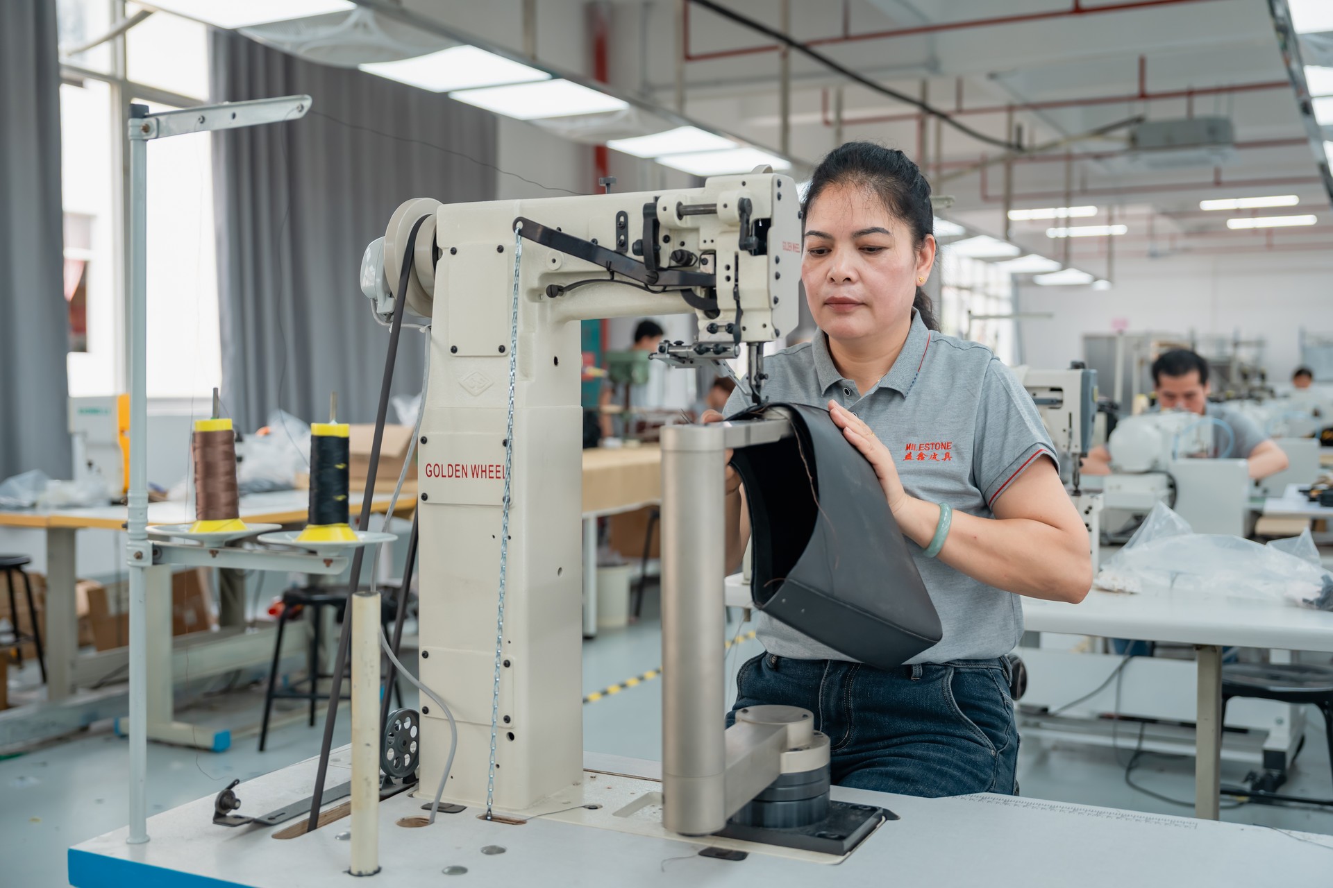
Milestone manages these limits through dedicated color calibration for leather, rather than applying Pantone formulas blindly. Our technicians compare swatches against our internal tools, including our own Pantone color chart reference, then adjust dyes in small increments to compensate for each hide's absorption pattern. The finishing team evaluates every batch under consistent light, checking for grain behavior, pooling, and surface response. This process lets us stay true to the designer's intent while respecting the natural character of the material.
Submitting accurate Pantone references is the first critical step in a smooth color‑matching workflow, especially when coordinating production across multiple teams or suppliers. Most designers start by sending the factory the Pantone number, the intended material, and any notes about finish or grain. When a project involves more complex textures or a signature look, teams often include mood images or previous samples, allowing the manufacturer to interpret the color with better context. This early clarity reduces the back‑and‑forth that typically slows down large production runs in areas like professional leather bag manufacturing.

Many brands rely on a Pantone color finder during the handoff stage because it helps convert a digital concept—often seen on a bright studio monitor—into something closer to how the human eye will read the shade on actual leather. Digital previews are never perfect, yet they serve as a bridge before the physical verification begins.
Once the factory receives the reference, technicians move to lab dips. These small test swatches reveal how dyes behave on a specific hide, showing everything from saturation shifts to how the surface absorbs color around the natural grain. Approving a Pantone‑matched leather swatch is the final checkpoint before bulk production. Teams often examine the swatch under multiple light sources, making sure a deep forest green doesn't suddenly appear muted under retail LEDs. Only after this sign‑off does the factory prep the full batch with confidence.
Professional Leather Color-Matching Workflow
| Step | Purpose |
|---|---|
| Submit Pantone reference | Establishes the baseline color target for the factory |
| Use Pantone color finder | Helps translate digital concepts to approximate physical tones |
| Review lab dips | Tests dye behavior on the actual leather type |
| Approve Pantone‑matched swatch | Confirms final color before full production |
Digital palettes rarely translate perfectly to physical materials, which is why designers often rely on tools that convert hex or RGB values into Pantone references. A hex to Pantone converter provides a quick snapshot of the closest standardized shade, and tools like our own color-matching option offer clearer direction when you're preparing a leather brief. You can try a more precise match through our digital color conversion tool, which helps narrow broad digital choices into practical Pantone candidates.
These tools are helpful, yet they do have limits. A screen can glow with color, while a leather panel absorbs dye into its grain; that difference alone can shift a match that seems perfect in software. Use the Pantone color finder as a starting compass rather than a final verdict, especially when you're chasing subtle hues like dusty mauves or deep olive tones.
The smartest workflow blends both worlds. Start with your digital palette, run it through a converter for a reference point, then compare that Pantone option against real leather swatches. This step grounds the digital vision in the material's texture, ensuring the final product reflects the color you intended, not just the one your monitor suggested.
Color accuracy shapes how a luxury brand is judged long before a customer touches the bag. When a shade meant to look deep and confident appears slightly dusty or flat, the product feels off, and even a well-crafted silhouette can seem less premium. Many designers first encounter this issue when they ask what is Pantone color and realize how much discipline is required to reproduce a single tone across leather hides, coated hardware, and woven linings. Each material absorbs pigments differently; leather may darken around the grain, metal reflects light in ways that skew warmer, and textiles can shift toward cooler undertones during bulk dyeing.
These small drifts add up. A bag that should read as one unified color story ends up looking pieced together from mismatched lots, which weakens brand identity at a glance. This precision is especially critical when adopting high-profile trends, such as the 2026 Pantone Color of the Year, Cloud Dancer; such iconic shades demand absolute intentionality to ensure they resonate as premium rather than accidental.
Milestone acts as a safeguard in this process. Our teams cross‑check Pantone targets against real‑world materials and run iterative sampling to ensure multi‑material color alignment stays intact from prototype to production, giving brands the confidence that the color they approve is the color that arrives in market.
In luxury leather manufacturing, Pantone is the quiet control center that keeps every hide, handle, and panel aligned to the same exact shade. Once you understand what is Pantone color in practical terms, it becomes a shared language between your design team, your marketing staff, and our tannery floor. By building Pantone-driven workflows with Milestone—from swatch approval to bulk-dye production—you reduce guesswork, cut rework, and protect your brand's visual identity season after season. If you're planning a new collection or refining a core line, our development team is ready to collaborate on precise Pantone leather that matches your brief, not just in theory, but in hand.
Ready to start your custom project?
Expert insights on care, styling, and manufacturing.
A Pantone Color Chart is a standardized system for identifying and matching colors, serving as a universal language for designers, manufacturers, and brands across various industries, including fashion. Each color is assigned a unique numerical code, ensuring consistency and accuracy from conception to production. This system facilitates precise color communication and reproduction worldwide.
The Pantone Color of the Year is a specific shade announced annually by the Pantone Color Institute, serving as a global trend forecast impacting fashion, interior design, and product development. It reflects cultural mood and societal shifts, influencing designers worldwide. This selection aims to highlight color's powerful role in expressing current global sentiment.
The Pantone Color of the Year program began in 2000. This initiative was launched to reflect the global cultural zeitgeist, with Cerulean Blue being the inaugural selection. It aims to influence product development and purchasing decisions across various industries, providing a symbolic snapshot of the year's mood, trends, and collective spirit.
The Pantone Color of the Year significantly influences fashion trends and consumer choices. It acts as a global trend forecast, guiding designers in developing collections, from apparel to accessories. This annual selection helps shape the aesthetic direction for the upcoming year, impacting everything from runway looks to retail offerings and product development across the industry.
No, using Pantone colors for commercial applications generally requires licensing or purchasing their official products. However, you can use alternative color references derived from Pantone standards, such as the Precise Color Matching Guide from Milestone. These resources provide a cost-effective way to find matching shades and coordinates for your creative projects without the need for proprietary software.
Although HEX codes are digital values and Pantone is a physical ink system, a professional Hex to Pantone color converter can instantly identify the closest visual match across proprietary libraries. Our digital Pantone color finder bridges this gap by instantly calculating the closest visual equivalent from thousands of swatches.
Pantone 7686 C is a rich, medium-to-dark blue. It presents as a sophisticated and vibrant shade, often likened to a deep royal blue or a classic sapphire. This versatile color offers a sense of stability and elegance, making it a popular choice for designs seeking a bold yet refined statement in fashion and various creative applications.
The Pantone Color Chart ensures consistency by providing a globally standardized system of precise color formulas and numerical identifiers. It serves as a universal language, allowing designers, manufacturers, and brands to communicate exact color specifications. This standardization minimizes subjective interpretation, guaranteeing accurate color reproduction across various materials, locations, and production runs worldwide.