Author: Ethan Publish Time: 2026-03-23 Origin: Milestone

Many buyers still wonder is PMS the same as Pantone, and the confusion usually starts with the name itself. PMS simply stands for the Pantone Matching System, a standardized catalog that helps designers, factories, and brands point to a precise shade instead of guessing through photos or fabric scraps. Pantone built its reputation on creating a common language for color, one that cuts through differences in lighting, screen calibration, or the natural variation found in materials. That clarity matters even more in leather and luxury production, where a slight shift in tone can turn a sample that looked rich and warm into something flat once it hits a finished bag or small‑batch accessory.
The Pantone Matching System functions as a standardized color identification method that helps brands, printers, and manufacturers talk about color without confusion. Instead of relying on screens or verbal descriptions—which often drift from the intended shade—the system assigns each color a unique code. That code becomes a universal reference, whether you're developing packaging artwork or matching a handbag panel to a client's seasonal palette. Pantone Matching System is used across printing, graphic design, fashion, and product manufacturing, which is why the terminology shows up in so many industries.

To make that consistency possible, Pantone produces tools such as the Pantone Formula Guide, a physical fan deck showing each color alongside the precise ink-mixing recipe needed to reproduce it. Designers point to a color number in the guide, manufacturers interpret the formula, and production teams around the world can recreate the same tone—whether it's a vivid red for a luggage tag or a muted taupe for a leather swatch. Many businesses keep updated tools like our own Pantone color chart reference edition close at hand for this reason.
A common question—is PMS the same as Pantone?—comes from confusion between the system and the company behind it. PMS refers to the standardized system, while Pantone is the brand that created and maintains that system. In practice, people often use the two interchangeably, but the distinction matters when you're coordinating color decisions across design, sampling, and final production.
Many buyers assume PMS and Pantone mean the same thing, but they're not identical. PMS refers specifically to the Pantone Matching System, which is the standardized library Pantone created to ensure consistent spot colors across print, textiles, plastics, and coated or uncoated materials. Pantone, on the other hand, is the broader brand behind multiple color systems, digital tools, and the widely used Pantone color guide. When teams talk about pantone leather color matching, they're usually referring to PMS swatches because they offer a predictable formula for manufacturers.
Earlier industry research notes that Pantone colors function as pre‑mixed spot colors, created with a fixed ink formula rather than blended during printing like CMYK. This is why the PMS system remains essential for manufacturers who need the same hue reproduced across different substrates, from coated packaging to soft-grain leather. Designers who want a deeper understanding of how these systems evolved across various materials can reference our breakdown in the discussion on Pantone color essentials.

In short, PMS is the most recognized Pantone system for print and product development, but it's not the brand's only system—just the one that keeps everyone speaking the same color language. Beyond PMS, Pantone offers the Fashion, Home + Interiors (FHI) system, designed specifically for apparel, textiles, and soft home goods. Within the FHI system, Textile Cotton eXtended (TCX) colors are dyed on 100% cotton to set a standardized color reference across the globe for designers working with soft materials, where traditional ink formulas from PMS do not apply.
Pantone colors behave differently depending on the surface they're printed or dyed on, which is why the distinction between Pantone coated vs uncoated swatches matters. Coated swatches represent how a shade appears on glossy, sealed paper where ink sits on top, producing sharper edges and richer saturation. Uncoated swatches absorb more, leaving the same Pantone code looking softer and slightly muted. This difference helps explain why someone might ask, is PMS the same as Pantone, because the code stays constant even as the finish changes.

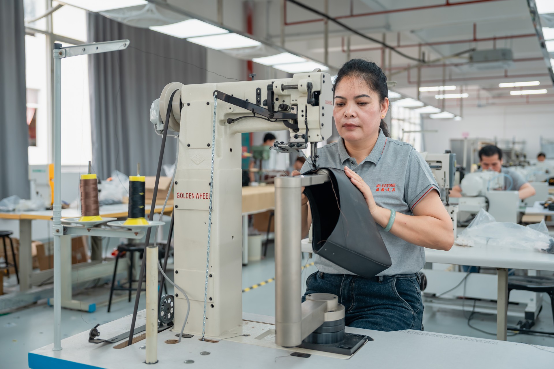
That consistency is intentional. Industry references note that each Pantone shade carries a unique identifier—such as PMS 186 C—to maintain predictable results across applications, even when the material itself behaves unpredictably. Natural surfaces like leather create the biggest challenge. The grain, oils, and minor flaws in each hide influence how dyes settle, meaning pantone leather color matching becomes as much about understanding the material's personality as it is about choosing the right chip.
Uneven absorption, subtle texture shifts, and batch-to-batch variations can nudge a color warmer or cooler than expected. Teams often rely on digital cross‑checks to tighten accuracy, using tools such as our own precise color converter to bridge RGB or hex values back to the appropriate Pantone reference. Even with these techniques, matching across materials remains a careful process of testing, adjusting, and verifying under consistent lighting to ensure the final product reflects the intended shade.
The question "is PMS the same as Pantone?" often comes up, and the answer matters more than many expect. Pantone is the brand; PMS is the standardized system that keeps a color identical whether it appears on coated paper, a metal zipper pull, or a piece of full‑grain leather. This consistency is vital in luxury manufacturing, where even a slight shift can make a finished bag look off-tone, as if two components came from different production runs. If you need a partner who treats color accuracy with the same precision you expect from your own brand, Milestone is ready to collaborate and guide your projects from sample to final shipment.
Ready to start your custom project?
Expert insights on care, styling, and manufacturing.
We ensure color precision through a rigorous physical verification process. Using official Pantone swatches, our specialists compare hundreds of leather samples from dozens of top-tier suppliers under Standardized Light Sources (such as D65). This meticulous side-by-side inspection guarantees the highest level of color consistency and eliminates any concerns regarding chromatic aberration.
Pantone manages unprintable CMYK shades by assigning them as spot colors, formulated with specialized inks outside the CMYK range. These custom-mixed hues allow designers and printers to achieve precise, vivid, or highly saturated tones that standard process inks can't reproduce, ensuring consistent color across materials and print methods.
Color shifts are common on nonstandard surfaces because rubber, textured fabrics, and other irregular materials absorb or reflect ink differently than smooth substrates. Variations in porosity, finish, and light scatter can alter how a Pantone shade appears. Designers typically run material-specific tests and adjust formulas to achieve the closest match.
Digital values are a great starting point. We offer a professional CMYK to Pantone Converter that calculates the Color Distance between your input and the matching PMS code. A lower distance score indicates a higher level of accuracy. We recommend using this tool to identify candidate colors, which our team will then verify using physical swatches to ensure 100% visual consistency for your final product.
Designers convert the PMS shade into a CMYK or RGB build and then fine‑tune it through test prints to get as close as possible to the original hue. They rely on calibrated monitors, proofing systems, and Pantone's process‑color equivalents to maintain consistency when true spot inks aren't supported.
It's automatically converted to the closest reproducible RGB value, which may cause visible shifts in saturation or brightness. Digital displays and LED signage can only show colors within their own gamut, so designers often preview soft-proof simulations and adjust nearby hues to maintain brand consistency as closely as possible.