Author: Ethan Publish Time: 2026-07-31 Origin: Milestone

The colors that quietly go with everything.
IN THIS ARTICLE
Most wardrobe mistakes aren't made in the closet — they happen at the accessory wall. You grab a dusty mauve handbag or a cognac brown handbag on impulse, and suddenly nothing in your wardrobe sits right.
The question of what color handbag goes with everything sounds simple. It isn't. Versatility has less to do with picking a popular hue and far more to do with color temperature and undertone — the invisible forces that make one tan handbag feel expensive and another feel flat.
Have you ever spotted a bag in a photo and found yourself wondering what to call that color — whether it's closer to taupe, ecru, or some precise industry standard? That instinct is exactly right. Think of this as a working map of versatile handbag colors, built on undertone logic, not generic advice.
Before color even touches a mood board, temperature is already making decisions for you.
Neutrals are not a monolith. Camel, ivory, and warm taupe sit on the yellow-red side of the spectrum. Slate, cool gray, and true off-white lean blue. Mixing warm-toned neutrals with cool-toned ones doesn't create harmony — it creates visual noise. A biscuit-colored handbag paired with a dove-gray outfit looks slightly off, even if no one in the room can name why. That tension is color temperature doing its quiet work.
Finish complicates this further. Matte leather absorbs light and reads cooler, pulling a chestnut bag toward a more serious, desaturated tone. A glazed or patent surface bounces light back, warming the same shade by several degrees. Two handbags in identical cognac leather can read as completely different colors depending on their surface treatment. This is why a bag's full character — its style, color, and construction — matters before committing to a pairing.
Throughout this guide, that's the framework: identify temperature first, then shade, then finish. Get those three in sequence and the rest follows.
If you want the safest starting point, this is it. These four shades form the backbone of most truly versatile handbag color palettes.
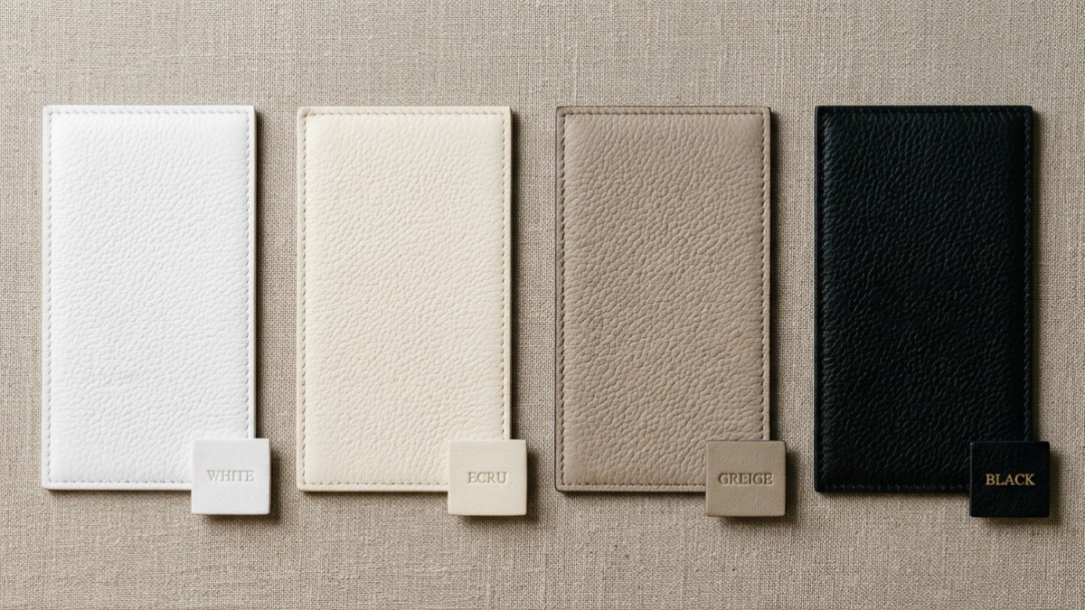
Same family, different undertones — the difference between ecru and white is subtle but unforgiving.
Black is the one color handbag that needs no justification. It reads cool-to-neutral in undertone — closer to blue-black than brown-black in most finished leathers — which is why it sits cleanly against both stark white tailoring and charcoal grey knitwear. The pairing logic is simple: black absorbs contrast rather than creating it, making it the go-to for buyers who want a zero-friction option across their entire range.
Optical white carries a blue undertone, which is exactly what gives it that crisp, high-contrast snap against color. It pairs well with cobalt, tomato red, and navy — any saturated hue that wants a clean boundary. What it does not do well is sit beside ecru or warm ivory. Place an optical white handbag next to a cream outfit and the bag reads cold and slightly dirty — a clash that's subtle but genuinely jarring once you see it.
Ecru sits in warm beige-yellow territory. Think unbleached linen, raw cotton, the color of morning light on pale wood. It dissolves into earth-tone looks effortlessly — camel coats, terracotta separates, dusty olive. A quality ecru color handbag avoids the "trying too hard to be neutral" trap that plagues flat beige. The key caveat: keep it away from bright whites (see above) and anything in the cool grey family.
Greige — the industry term for grey-beige blends — is arguably the single most neutral color handbag on the market today. It carries no strong warm or cool bias, which means it floats between seasonal palettes without committing to either. Buyers stocking across spring/summer and autumn/winter lines consistently reach for greige precisely because it doesn't fight anything.
Ever spotted a handbag in a shade you can't quite name? Our Pantone reference guide maps these in-between neutrals to standard color codes and includes a downloadable color chart, making it easier to compare shades across seasons or suppliers.
Classic Neutral Handbag Colors: Undertone & Pairing Quick Reference
| Color | Undertone | Best Pairings | Watch Out For |
|---|---|---|---|
| Black | Cool (blue-black) | White, charcoal, all saturates | Almost nothing — highest versatility |
| Optical White | Cool (blue-tinted) | Navy, cobalt, tomato red | Ecru / warm cream outfits (color clash) |
| Ecru | Warm (yellow-beige) | Camel, terracotta, dusty olive | Bright white, cool greys |
| Greige | Neutral (grey-beige blend) | Nearly everything; cross-seasonal | Very high-contrast color blocking |
Earth tones do more than feel warm and familiar. The right one can add richness without sacrificing day-to-day versatility.
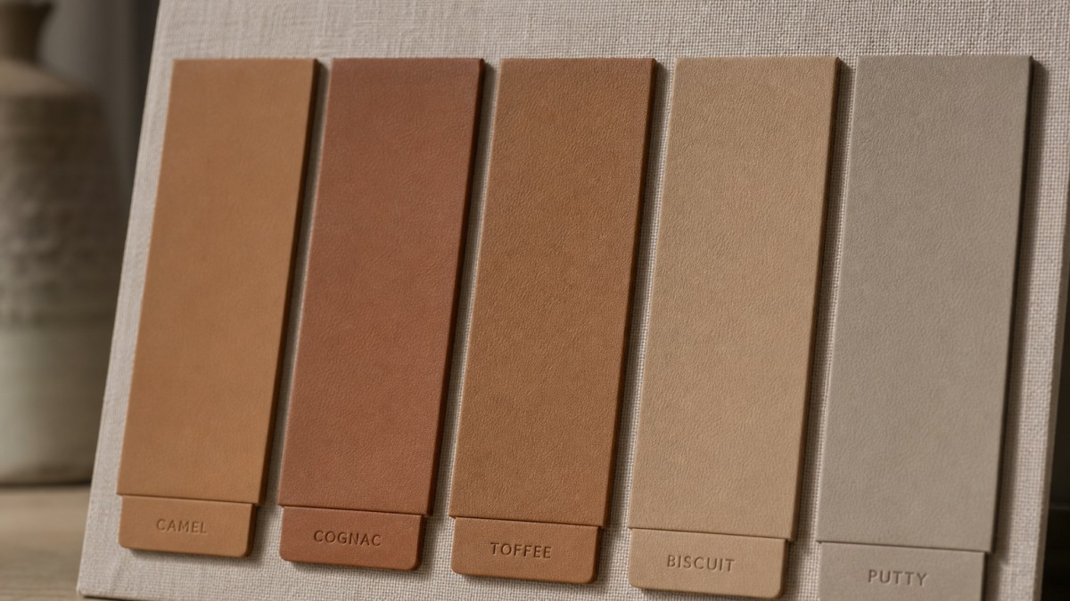
Earth tones earn their versatility through nuance — not all brown-based handbag colors behave the same way.
Camel is the color that makes a tan leather handbag feel aspirational rather than safe. It sits in that golden-neutral zone — warm enough to read as rich, pale enough to pair with charcoal, cream, ivory, and even soft blush. Camel works across spring through fall without adjustment, which is why it remains the commercial anchor of earth-tone handbag ranges for most buyers.
Don't lump cognac in with standard tan. The difference is real: cognac carries a warm amber undertone that deepens in sunlight, almost glowing against warm or olive skin tones. Think of aged brandy in a glass — that's the color. Where tan reads "neutral," cognac reads "intentional." A cognac color handbag earns its place in a capsule collection precisely because it has a point of view.
Toffee lives between cognac and chocolate — stickier, richer, slightly more brown. It pairs surprisingly well with dusty rose, sage, and muted mustard. If your buyer is building a versatile handbag colors range for the transitional fall market, toffee bridges the gap between warm-weather neutrals and full winter depth without disappearing into either.
Biscuit is the earth tone people reach for when they want a near-neutral that isn't beige. It has a faint warmth — a hint of oat or wheat — that keeps it from reading cold. Against denim or tailored gray, a biscuit color handbag looks effortlessly considered.
Putty is quieter still. It's a muted, almost architectural neutral — closer to greige than brown — and it photographs beautifully in lifestyle content.
Not every versatile bag has to be light or obvious. These darker shades bring depth, polish, and surprising flexibility.
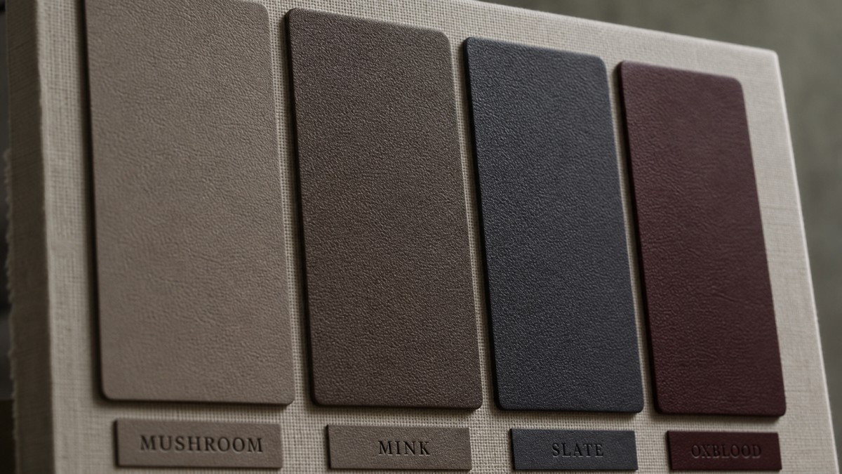
These deeper shades behave like stealth neutrals, adding depth without sacrificing flexibility.
Mushroom sits in that quiet space between beige and grey — warm enough to soften a cool-toned outfit, neutral enough to disappear against earth tones. A mushroom color handbag pairs with oatmeal knitwear, soft white linen, and camel coats without creating any visual friction. It reads understated luxury rather than playing-it-safe. Think raw suede, unlined edges, a texture that almost looks edible.
Richer than mushroom, mink leans toward a dusty brown with a subtle greyish veil over it. It handles both monochromatic dressing and bold contrast better than most expect. A mink color handbag next to burgundy separates, olive trousers, or even a deep navy blazer? Cohesion, every time. The tone is warm but never loud — the kind of versatile handbag color that quietly does the heavy lifting across an entire week of outfits.
Navy gets all the praise. Slate deserves the crown. Where navy can clash with black or compete with cobalt, slate glides past those conflicts entirely. Its cool blue-grey tone makes it one of the rare neutral color handbag options that bridges formal workwear, casual weekend dressing, and evening looks without adjustment. Paired with charcoal, ivory, rust, or pale pink — it holds its ground without dominating.
This is the most underrated color handbag choice in any fall or winter wardrobe, full stop. Oxblood — that deep red-brown sitting somewhere between dried merlot and polished mahogany — functions as a true neutral once temperatures drop. It grounds all-black outfits, adds depth to camel and forest green combinations, and brings warmth to grey without the predictability of burgundy.
The colors covered so far work precisely because they suppress their own saturation. These next ones take a different approach — they carry real chromatic presence, but their undertones are calibrated carefully enough that they still function as near-universals.
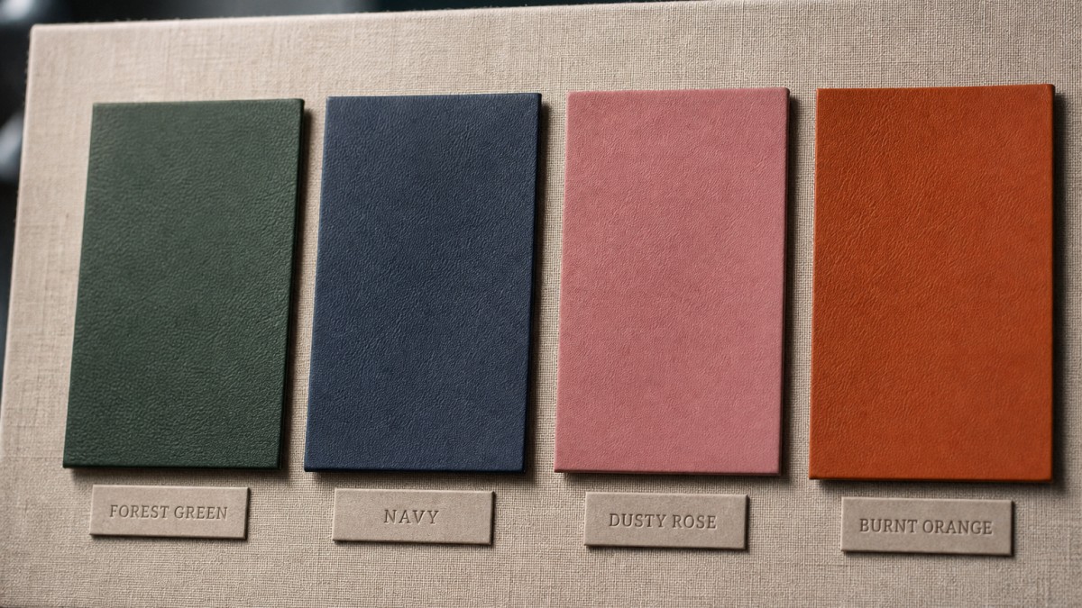
Color can still act like a near-neutral when saturation stays controlled and undertones stay balanced.
Forest green sits at a saturation sweet spot: dark enough to anchor a look, muted enough to avoid screaming. Its cool-to-neutral undertone means it pairs with camel, cream, navy, rust, and even blush without competing. A forest green color handbag reads sophisticated in a boardroom and relaxed at a weekend market — same bag, different context. It's worth noting that multiple color authority brands have independently converged on green family hues for 2026 — from smoky jade to deep muted garden greens — which signals this isn't a flash-in-the-pan moment. It's a direction.
Navy is the chromatic neutral nobody talks about. It functions like black but with more personality. The blue undertone keeps it from feeling stark, while its depth prevents it from reading casual. A navy color handbag sits effortlessly beside warm terracottas, cool grays, and soft whites alike — it's essentially a color handbag for every outfit.
The dusty part is doing all the work here. Strip away the gray-mauve overlay and you'd have a pink that clashes. Keep it, and you have a color that plays nicely with stone, olive, chambray, and even burgundy. Its warmth is whispered, not announced.
Burnt orange earns its versatility through a deep ochre undertone that roots it firmly in earth tones. Unlike a true orange, it doesn't demand attention — it just adds warmth. Paired with denim, chocolate leather, or forest green, a burnt orange color handbag becomes the quiet focal point every outfit needs.
Most style guides hand you a color wheel and call it a day. What they skip is the variable that actually determines whether a bag works on you — your skin's undertone.
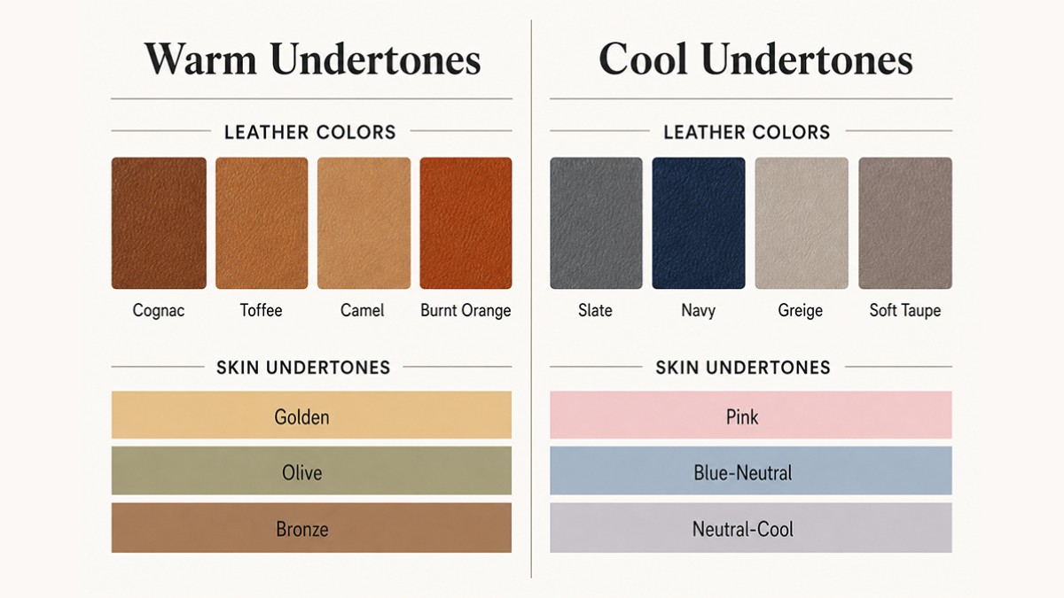
Undertone alignment is the shortcut stylists use — now you have the same map.
Warm undertones (golden, olive, bronze complexions) pull richness from earthy, sun-baked hues. A cognac leather handbag or a deep toffee bag catches the warmth already living in your skin and mirrors it back. Camel sits slightly lighter, a versatile daily option that reads polished without effort. For something with more heat, a burnt orange color handbag pushes the contrast just enough to feel intentional rather than accidental.
Cool undertones — that pink, blue, or neutral-cool cast beneath the surface — respond differently. Slate and mink color handbag options carry a grey-adjacent sophistication that flatters without fighting your skin's natural temperature. Navy runs deeper and anchors almost any look. Greige (that near-perfect grey-beige hybrid) earns its reputation as the quiet workhorse of cool-toned wardrobes; it's practically the definition of what color handbag goes with everything, when paired correctly.
This undertone-to-bag mapping is something most mainstream guides quietly ignore — it's the kind of editorial shorthand that lives in fitting rooms, not blog posts.
Skin Undertone × Bag Color Compatibility Matrix
| Undertone | Skin Cues | Recommended Bag Colors |
|---|---|---|
| Warm | Golden, olive, bronze | Cognac, toffee, camel, burnt orange |
| Cool | Pink, blue, neutral-cool | Slate, mink, navy, greige |
| Neutral | Mix of warm & cool | Camel, greige, mink (bridges both) |
You're scrolling through Instagram when something stops you cold — a tote caught in a shade somewhere between dusty rose and old mauve, or a clutch in a color so close to eucalyptus it reads botanical without being green. The bag is perfect. The color? Completely unnameable.
This is the gap between loving a color handbag and actually sourcing it at scale.
The problem isn't exclusive to trend chasers. A buyer hunting for a cognac handbag finds three suppliers calling the same hue "caramel," "amber," and "whisky." Someone who spotted a top-handle in what the internet vaguely labels "clay" hits a wall when a factory samples terracotta bisque instead. Even a classic slate-blue handbag can drift into dove grey or soft indigo across different dye lots — and suddenly no one is ordering the same thing.
Pantone bridges that ambiguity. As the global standard for color communication across fashion, materials, and manufacturing, Pantone collapses the guesswork into a single universal reference number. One chip. Same meaning in New York, Milan, and Guangzhou.
When you spot a handbag in a photo with a color you instantly want to track down, use Milestone's RGB to Pantone online converter for handbags to identify the closest match — before you place your next order.
For retail buyers building a floor-ready collection, six neutral color handbag staples do the heavy lifting year-round: black, greige, cognac, slate, oxblood, and forest green. Black needs no defense — it's the anchor. But greige is where things get interesting. That warm gray-beige sits in a strange, flattering middle ground that photographs well online and reads as "sophisticated" on a shelf. Cognac brings warmth without loudness. Slate keeps things modern without committing to full gray. Oxblood? It's the one color handbag buyers always underestimate until it outsells navy three seasons running. And forest green has quietly become the new neutral — customers who'd never reach for a colored bag pick it up instinctively.
Seasonal rotation is where the real margin optimization happens. Swap biscuit and putty tones into your spring-summer assortment — those dusty, sun-bleached shades move fast in lighter linen and canvas — then pivot to toffee and mink for fall-winter, when customers want something that looks like it belongs next to a cashmere coat.
The strongest assortments are rarely planned at the last minute. Even Pantone's annual color forecasting process starts months before the public December reveal — a useful reminder that next season's handbag palette should be discussed during sampling, not after inventory decisions are already locked in.
The real challenge for B2B buyers isn't just knowing which colors sell. It's locking that direction early enough — and sourcing it consistently across runs. A cognac that shifts two shades between MOQs quietly erodes brand trust.
Milestone works with buyers on custom colorway development and Pantone-matched sampling — so what's on your mood board matches what arrives in the shipment.
Figuring out what color handbag goes with everything was never really about defaulting to black. It's about reading three variables — color temperature, undertone, and finish — and understanding how they interact with what's already in a wardrobe.
When a specific shade catches your eye and you can't quite name it, match it against a standardized color reference. That gap between "looks like taupe" and "actually Pantone 16-1318" is where buying decisions go sideways.
For retailers, this framework matters at the sourcing stage. A well-curated assortment isn't just broad — it's intentional. The brands that move product season after season build their color strategy before they ever touch a sample.
Ready to start your custom project?
Expert insights on care, styling, and manufacturing.
A nude bag is one of the most versatile investments you can make, transitioning effortlessly from weekend errands to formal evenings. During the day, it softens casual outfits; at night, its understated elegance complements gowns beautifully. Choose structured silhouettes in quality leather to ensure the bag reads appropriately across both settings.
Nude or tan is your safest choice when pairing with bold printed outfits. These neutral, skin-toned shades recede visually, letting the print take center stage without competing for attention. Black can sometimes feel heavy against busy patterns, while nude effortlessly blends and balances even the most vibrant, complex designs.
Tan edges out camel for cool-toned wardrobes because its lighter, slightly grayer undertones clash less with blues, purples, and grays. Camel's rich, golden warmth can feel disconnected from cool palettes. That said, both work as neutrals — just style tan with silver hardware to keep the overall look cohesive.
Cognac brown is versatile enough to be your everyday bag, but it works differently than black. It pairs beautifully with neutrals, earth tones, and denim, yet can clash with cool-toned outfits like navy or grey. If your wardrobe skews warm, cognac may genuinely replace black — otherwise, treat it as a complement.
Tan or camel is the neutral that truly flatters navy, creating a warm, sophisticated contrast that black can sometimes overpower. Cognac brown works equally well, lending a rich, earthy tone that complements navy's depth. Both shades also transition seamlessly across casual and formal looks, making either a smarter all-around investment than classic black.